What is a landscape picture?
The first things that come to mind when I hear the word landscape are nature and vast hills and mountainous expanses of land, endless beaches, dense jungle and everything in between. Although, also the less conventional images pop to mind such as a landscape orientation of an image or even a city skyline or even the view out of my window. All of these are linked to landscape via many different common factors. Words that pop to mind include: Hills, land, park, woods, nature, mountains, jungle, cliffs, oceans, seas and skylines. After a quick google search of landscapes these are the images that come up;
The first things that come to mind when I hear the word landscape are nature and vast hills and mountainous expanses of land, endless beaches, dense jungle and everything in between. Although, also the less conventional images pop to mind such as a landscape orientation of an image or even a city skyline or even the view out of my window. All of these are linked to landscape via many different common factors. Words that pop to mind include: Hills, land, park, woods, nature, mountains, jungle, cliffs, oceans, seas and skylines. After a quick google search of landscapes these are the images that come up;


These image have mountains and a pretty sky with very vivid and bright colours, the majority of them also have a lake with a pristine, crystal clear reflection of the landscape above. In my ideal landscape, I would have tall and jagged mountains surrounded by deep fir woods dense and vivid, peaks snow tipped and icy, the base would have a massive lake still and calm with a beautiful blend of orange and pinks in the sky reflecting off of the lake making a perfect double image. In contrast to this however, when I look outside of my classroom I see dead grass reviving for summer and a grey and bright sky of white clouds covering the landscape making it a dull grey; England has moderate weather and very calm temperatures causing these almost boring views because nothing exotic can grow and the clouds usually cover the sky leaving no room for sun to lighten up and make the landscape brighter.
Tanja Deman

Tanja Deman's images are very interesting and really showcase digital editing of images and the stitching of reality that it can provide. Her work of altered reality I really like and my favourite image is the one depicting a theatre with massive crystals looming over the onlooking audience. The naturalistic feel to her images outline the closeness of humans to nature via the almost intrusion of the nature in the manmade structures making it feel like they are the outlier that doenst fit into that scene; but this is most likely intentional to show that it shouldnt be that nature is the intrusive one but that we are and that we should be more mindful about our planet rather than being so single minded. Another feature of the images I selected all have an audience of some sort watching the nature as if it is entertainment or a marvel which could entirely flip my first interpretation of humans seeing nature as intrusive and inferior to humans seeing the beauty of nature and that it should be admired in marvel (similar to how we watch movies and shows that in these images the nature has replaced it with). Notably as well, all of the images are monochromatic and black and white, this could have a deeper meaning or it could just be to convey a certain time period or mood that Uta wanted to match with the images.
|
This is my attempt at collaging nature and man made structures together using paper, scissors and glue: I like it and think it turned out very well but don't think it is as seamless as Tanja's work where it looks real. When creating the image I had the thought process of the city skyline being reflected into the water as the snow-tipped mountains to remind us of where we came from and the true natural form that they embody nut i don't think this is conveyed as clearly as I wanted it to be. After making the first stitch up of the mountains and city I then photocopied it out onto acetate (right) to then take it into the dark room to create my negative image (bottom left). Then using my negative I made the positive which had purposefully a lot of water on it to create an almost rainy effect in the final image but I don't really like how it turned out because it is a bit too overpowering with all of the water marks on the picture. Finally using the acetate again, I made a cyanotype ,which works very similarly to making a photogram in the dark room, using sunlight on the concourse and the acetate to put over it to create an outline onto the special cyan paper. Once reacted with sunlight for around 7 minutes I brought it back inside and washed it and left it to dry. I also made another cyanotype which I exposed for 5 minutes instead of 7 which wasn't as clear and was under exposed. In conclusion, the collage work as a whole ,in response to Tanja Deman's, was successful and I liked creating the image and I also like the outcomes that came out of it; From this work I have clearly seen that I prefer editing the image in real life over online.
|


|


Out of focus landscapes
Uta barth


|
Uta Barth makes these really interesting images that are intentionally out of focus and 'blurry'; the images show landscapes and places that are just recognisable behind the blur of the camera lense. Some words I would use to describe these images are abstract, nostalgic and obscured because they don’t necessarily follow the rules of traditional photography where everything blurry is wrong as well as providing comfort and familiarity as if the blur makes the images more recognisable where it can almost be anywhere you believe it is. I assume these images were created using standard camera photography which was either focus locked to out of focus or it was blurred in pre post production such as photoshop or other editing software. Moreover, I like the excessive use of lines and leading lines especially because so much of the image is obscured from vision via the blur; the lines really give a good idea of what the image is and what the subject and background are where this would be less apparent without these dominant lines in her images. Below are my attempts of out of focus landscapes: I don't massively like them because they are all boring areas around where I live so I am very familiar with them whereas someone else who doesn't live around me may see them very differently. Next time I will add more editing processes to offer more variety in colour as the same greys and greens are repetitive.
|
Bill Armstrong
|
Bill Armstrong's work has a very clear emphasis on colour and shades as all of his images are very colourful, full of yellows, blues, magentas and pinks. The choice to make the photos out of focus is very interesting because it gives the figures a very eerie feel as they are ominous dark outlines without emotion or easy definition of gender or any way to recognise them; this evokes the fear of the unknown and that fear of something that is unidentifiable. For me the clear shapes and lines in his images showcase leading lines in a very unconventional image that doesn't seem to follow any of the other rules of classic photography is very interesting. Moreover, the colour choices in his compositions are intriguing because they are contrasting colours placed next to each other where they make the background landscapes look almost un-earthly or extra terrestrial; and the sometimes mismatched colourful figures also fit this classic depiction of an alien or an extra terrestrial being where they are many different colours. Although, this makes me think about why he made all of these choices to obscure the figure as much as possible and disguise the background along with it to where they both look other worldly? To use this to take my own set of out of focus images I will make sure to encorporate a lot of colours to add to. The ambiguity of the images magnify the mystery about what is pictured in them.
|
|


This was my response to the work by Uta Barth which focuses on out of focus images. This piece was quite easy to recreate because I really didnt have to think about a lot of the aspects of a normal photo like of course it being in focus, some forms of lighting and the actual scene happening in the image because it is all obscurred. In conclusion, next time I will use a variety of scenes rather than them all being trees or
Minimalist landscapes

|
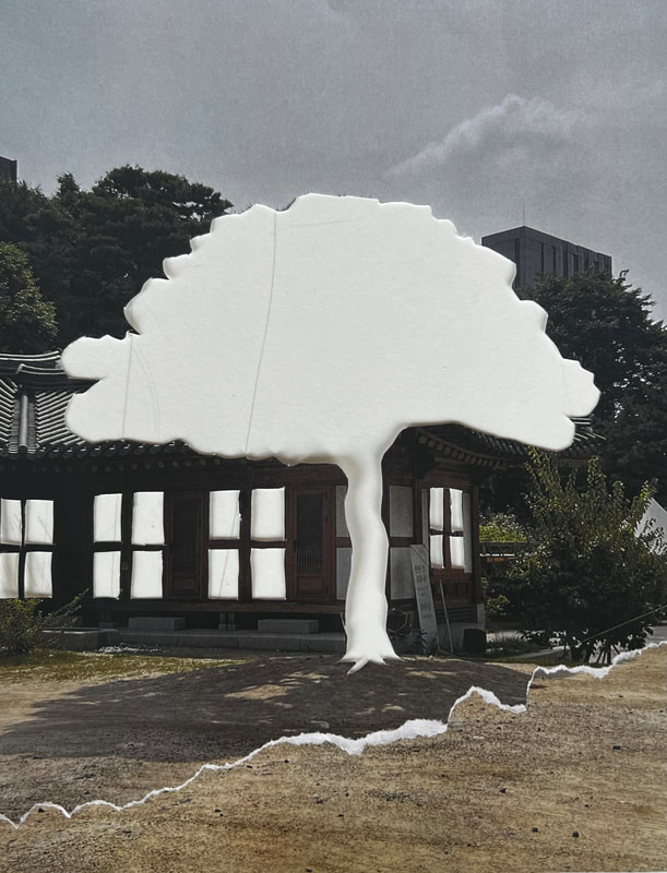
To create this photogram I used one of my own images from Korea and started removing certain aspects to abstract it over time. First I removed the tree as it is the main focus point of the image and removing it makes the image look emptier; I then experimented with making a different layer of thickness on the paper by tearing it to add texture and then sticking it onto the bottom part of the image after cutting out the intricate windows/ panels on the wall to take even more out of the image. Finally I cut out the building in the background and was finished with the abstraction but will come back and take away more later and keep experimenting until it is unrecognisable. The cut-out holes make room for the light to come through which will then expose the photographic paper leaving an outline/imprint. When exposing my photo paper to the enlarger I was adjusting the positioning of the paper to fully fit under my template it was slightly getting exposed making different layers of the template in the final image (below). After being exposed for around 15 seconds it went into the developers for around 1 minute each and was then into the water to stop the reaction when brought out of the dark room.
|
|
I am overall happy with the results and like how it turned out with the different layers and upside down shadow caused by me accidentally flipping it when aligning it. The shadowey eeriness of the image is really hyperbolised by the default monochromatic colour palette the photogram gives it as well as the multiple layers of windows and tree making the objects look translucent almost mimicking a ghost or spectral figure. Furthermore I really like how the tearing of the page is very visible and the thickness difference is also visually noticeable along with the actual temple textures coming through even though I didn't cut that part out. This just shows that experimenting can lead to unexpected outcomes that maybe wouldn't have been found if I didn't explore the possibilities.
|
|

Google street view bingo
In this task we spun a randomising wheel that told us the city we needed to look for the subject in then another wheel to decide what we was searching for and then had 5 minutes to find as many of that thing as possible. I really liked this task because I got to photograph some things from all across the world; for example in Jamaica I photographed a sports running team after a run that seems very real and raw even though it was through a computer back in England. Furthermore, I really liked the random glitches that kept happening because of the images being stitched together in google maps. My favourite image showing this is pf a man that has been cut in half and stitched with another arm attached to his visible arm in the water section in Taipei. Next time I will focus on what I also like the look of as an image rather than following a set criteria because when searching I saw a couple cool opportunities for framing and some interesting structures that I wanted to image.
Asmara- Shadow of a tree


San Francisco- Animal


Taipei- water


Rome- Bicycle


Nairobi- graffiti


Helsinki- google glitch


Brasilia- tall building


Paris- Trains and buses


Athens- Someone pointing/ google glitch


Kingstown- Sport


Personal google maps images: Chernobyl


After exploring different countries on Google Maps for a safari for certain things around the world above this section, I decided to make my own section of images about a certain place of interest that I was intrigued in: I decided to pick the Nuclear disaster site of Chernobyl, Pripyat in Ukraine because of its historical significance and the abandonment of the houses, hotels, boats, supermarkets all left as they were when the reactor meltdown occurred. The aesthetic and mood captured in each picture resembles the tragedy and eeriness of present Chernobyl: lone people going on with life, the decrepit structures and reclamation of nature really shows the magnitude of the power behind these pictures.My favourite image is either the one depicting the boats or the image of the empty blue room with the light rays streaming in through the mossy windows because of the lighting, the message indicated behind them and the colours popping off the image with the orange rust juxtaposing the murky water below and the vivid green weeds surrounding the lake as well as the baby blue walls contrasting the yellow peeling wallpaper above with the light flowing in. Both of these images are visually pleasing with mix of colours, the use of space and leading lines with the floor panels leading to the windows and the back wall and the boats hull slowly leading all the way to the centre of the image to then exceed to the other end of the frame.
In conclusion, I really like these images and am glad I chose this area to photograph as it provides an insight into a regenerating place of mass disaster; this type of photography, although maybe seen as lazy, is very interesting as you can explore the whole world and in fact places that may not be accessible all entirely from the comfort of the classroom. Next time I might focus more on some less seen places which are not necessarily common sight or just photograph some other images contrasting the narrative surrounding Chernobyl of being this nuclear wasteland.
In conclusion, I really like these images and am glad I chose this area to photograph as it provides an insight into a regenerating place of mass disaster; this type of photography, although maybe seen as lazy, is very interesting as you can explore the whole world and in fact places that may not be accessible all entirely from the comfort of the classroom. Next time I might focus more on some less seen places which are not necessarily common sight or just photograph some other images contrasting the narrative surrounding Chernobyl of being this nuclear wasteland.
Disrupting landscapes
Dafna Talmore


|
Dafna Talmore, a lecturer and artist from London creates disrupted landscapes and altered images through physical editing such as playing with the chromatics of the edges to cutting the image into pieces, rearranging and removing some like a big messed up puzzle; her alterations allow for a mass variety of interpretations about the message being conveyed as well as what the actual image depicts as well. The alterations made to the original images also encompasses certain photographical features such as leading lines drawing the viewer to separate parts of the frame and to certain subjects. Her work inspired me to respond with my own pieces; when on a photowalk in Peckham I took a lot of landscape images of the people, the urban environment and the street art which I all found very interesting so reused them for this response. I printed the images out on acetate very small in order to fit into the slide projector; once printed out I altered and changed the compositions with scratching using a scalpel to using different shapes of coloured gels to modify the final outcome. In the end, and after creating all the new pieces I really like the one depicting the dark figure in the golden room surrounded with scratches and damage as it is very visually pleasing as well as clearly has deeper meaning and links to mental health whilst being a beautiful composition with the colours and patterned wall in the foreground: Leading lines and rule of thirds all accumulate to make it an abstraction evoking feelings of confusion yet nostalgia where it seems familiar. I also really like the damage and changes made to the first and the fourth images as it is representative of the area of Peckham whilst also still providing beauty and comfort as a whole microcosm.
|


|


personal response
Pete Humphrey


|
Pete Humphrey is English photographer who is not widely known but has had many of his images featured in local and national newspapers and won the Bargate Quarter Competition in 2018 due to his awe-inspiring landscapes. Among his many collections of natural landscapes I chose the images specifically depicting the New Forest as it is a place I used to go all the time on holiday and feel a sort of connection to; the beauty of the new forest is presented in these images perfectly through the use of the sunset colours blending, the rays of light creating leading lines into the subjects of the images and the overall contrast and thought put into his compositions. I particularly really like the image on the left because of the colours incorporated from the golden glow of the sun to the vibrant pinks and purples of the lavender and heather paired with the silhouetted tree in the middle-ground. This draws attention to the centre of the image due to its contrast to the rest of the image. All of Humphrys framework is very prodigious staying parallel to the multi layers of trees and perfectly balancing the weight of the pictures between the fore ground, middle ground and back ground whilst also demonstrating the importance of empty space as well. Although, in his images there are some cases of fixation regarding his subjects and landscapes, but to improve on this he could branch out to have a wider variety of images.
|
However, apart from that minor challenge his images are some of my favourite landscapes I have ever seen and I will take away his use of extensive layering and playing with timings of the day and how that effects a photograph in my own response E.G in his images he often uses sunsets or misty scenes to make a scape look entirely different to what it would look like if it was clear weather at midday.
Pawel Piech


Piech focuses on urban landscapes and the shapes and angles created by certain architecture within cities. I particularly like his
work because he mainly photographs my home city, London and the areas Im very familiar with from childhood creating a sort of
eeriness in some of his pieces where the black and white tone makes the areas uncanny. Photographically, his images are very
thought out with the patterns, leading lines and rule of thirds creating near perfectly aesthetic pieces of art satisfying to look at
and explore through the frame. Pawl's choice of displaying his images in a black and white filter is unique and intriguing and has
disadvantages and advantages, these include:
• Lack of colour and chromatic variety making some look very similar and boring to look at.
• Limiting the image to black and white only allows for further refining in other features of the image. Due to the photographer
not having to consider the colours in his image and can focus on other aspects of lighting and shadows which have been
highlighted by the filter.
• Black and white is a very polarising concept in photography and some may not like the two tone style that these types of
images are captured in.
“Color is very much about atmosphere and emotion and the feel of a place.” – Alex Web
Although, with all this said Pawel does an amazing job of avoiding some of these critiques and cliches about this form of photography; my favourite image of his is either the one depicting the pigeons seemingly surrounding by flats and apartments or the image of the man walking through the tunnel with water beside him reflecting the underside of the bridge into the water creating a full circle. Both share a clear focus of shapes and different forms that can be fabricated into a singular frame, for example in the tunnel image the clever incorporation of the reflection to ultimately form a complete circle. To counteract the empty space on the left hand of the picture the person walking through on the right perfectly balances it out as a silhouette combatting the white and greys to the right. Furthermore, the image has a central leading line through the middle that leads the viewers attention past the tunnel, past the person and over to the boat in the background.
My response


|

|

|

|

The images above are in response to the works by Pawl Piech where he focuses on a monochromatic filter of black and white as well as inner shapes made by the architecture or landscapes. These pose as a starting point for digital editing and a gateway into my final project. I think my responses accurately represent his work and are obviously inspired by him but on some of the images I have digitally edited them to be more interesting and unique. However, I could further edit them into more of a constructed landscape than it is in the image above. The editing was really simple and basic but still effective with the easy copy and paste using ctrl c and v three times and rearranging the copies after using the magnetic lasso tool to trace the outline of the subject skater; This effect works really well and almost looks realistic as the black and white filter makes it so that the colours and details that would make it look unnatural are hidden and disguised.
Additionally, the other unedited images could be improved on but evidently I was really focusing on the blatant shapes within the images (a reoccurring motif within Pawel’s work) like the circle created by the fairground ride, the rectangles and lines created by the bridges over the road, the endless rows and squares of the Korean cityscape and the irregular oval created by the skate bowl. Out of all the images in my response I really like the first one showing the spinning fairground ride as it has a centre leading line matched with the circle on top and the empty space perfectly balancing the whole image out.
Additionally, the other unedited images could be improved on but evidently I was really focusing on the blatant shapes within the images (a reoccurring motif within Pawel’s work) like the circle created by the fairground ride, the rectangles and lines created by the bridges over the road, the endless rows and squares of the Korean cityscape and the irregular oval created by the skate bowl. Out of all the images in my response I really like the first one showing the spinning fairground ride as it has a centre leading line matched with the circle on top and the empty space perfectly balancing the whole image out.

Starting point


Making day
So far the making day is going to plan and I am making good progress with the final project I had envisioned: I have cut out my images alomg with the black card backing to provide extra rigidity, printed out the A3 copy of the landscape and put it in my frame and made adjustments to most of the images I will be using. The end product of the making day is very successful with the images and elements having all come together to make the hanging piece special and come together effectively. The process started with choosing images and selecting certain pictures from my 3 week trip to Korea and mounting them onto black cardboard, then using a staple gun and string hung them in duos and singles to a plain and empty white picture frame; this made it look like a dream-catcher of my memories of Korea which is exactly how I envisioned it looking. The tying together of the dramatic news headlines as well as the quotes from different articles gave the piece an eerie feel that tells a story. Once the frame was hung from the ceiling also using string, I used two separate spotlights from different angles to add an extra level of depth within the photographs I will take to put on this website as well as experimenting with different colours of films and gels to put over the lights so shadows from one side come out yellow but the ones from the other comes out purple as well as changing the whole mood of the photos and piece as a whole as well. The images I chose are very appropriate for my theme and task I wanted to carry out so if I did it again I would use the same or similar images as they demonstrate my peak photographical skill and neatly fit within the theme. However, one of the only issues I have with the finalised project is that I wished I disrupted , edited and altered the actual images a bit more and displayed the headlines in a more visible way with bigger font and different and larger ways to present them.
In conclusion, the piece is successful with my main aims for the end project being met and I overall like the look and technicality of it with the ambitious method of presentation along with the technicality and skill used in the photograph taking in Korea taking into account methods such as 'rule of thirds' and leading lines. Although, on the other hand, the presentation lacked in functionality in the headline aspect of it with the writing being relatively small and illegible. But as a whole the piece is a good end to my project.
In conclusion, the piece is successful with my main aims for the end project being met and I overall like the look and technicality of it with the ambitious method of presentation along with the technicality and skill used in the photograph taking in Korea taking into account methods such as 'rule of thirds' and leading lines. Although, on the other hand, the presentation lacked in functionality in the headline aspect of it with the writing being relatively small and illegible. But as a whole the piece is a good end to my project.


