|
The five elements of a portrait are: composition, framing, lighting, subject and a background.
The first time I remember seeing a portrait photograph was when I was about 3 or 4 and I was in nursery and I saw my Mums house keys and it had a picture of me and my sister in father Christmas outfits hugging in a doorway. The photograph wasn’t printed but was in a sort of laminated thick plastic keyring with a second side of the same picture. If I was to describe the image in a list of words I would say love, happiness, excitement and joy. Photography has changed since the first time I remember seeing a photo as the camera quality has greatly improved and the image was a bit blurry. |
|
What is a genre?
A genre can be described as a category or group which classifies types of anything such as photography. As demonstrated below the genre of portraiture can have many different forms and sub genres within it such as identification photography (passport images or driving license pictures), studio, police mugshot, self portraits and family snapshots. For some of the images the facial expression is serious and for some it is a calm and more relaxed stance and pose due to the different circumstances of the pictures. Furthermore the subject looks down the camera in most of the sub genres but not in some like in family snapshot as it is a a snapshot of a group of people in motion. The poses the subject is going to pull in most of them is a straight hands down to the side stance as they are serious and formal ways to identify them.


In evaluation, in some of the images the facial expression is serious and for some it is a calm and more relaxed stance and pose due to the different circumstances of the pictures. Furthermore, the subject looks down the camera in most of the sub genres but not in some, like in family snapshot as it is a snapshot of a group of people in motion. The poses the subject is pulling in most of them is a straight hands down to the side stance as the identification images are serious and formal ways to identify them.
Compare and contrast


- The similarities between the two images are that they are both in black and white; they also have a singular person in the centre who are the subject. Although, the differences between the two is that one is of a very alive and conscious person staring down the camera whereas the other one is of a dead/unconscious man; they are also different distances from the camera.
- I think that the photographs are different colors as one is in the daytime and the sunlight so the image gets a warmer tint whereas the drowned man is in the dark with a light source on him. Although, it is very hard to make out where he is so I could be completely wrong as the background is indistinguishable.
- I think that the image of Robert Cornelius is just an image from the shoulders up as they probably wouldn't have the access to wider lenses back then and have a limited field of view. The distance of the camera from him is also a factor.
- In my opinion, the Hippolyte Bayard image is laying down because as the title 'The Drowned man' suggests he is acting unconscious and therefore would not be able to stand up and must be laying down.
- I would say that Bayard is a creative and inquisitive person as he is posing as a drowned man. I think this because I don't think any person would just get the thought to take a self portrait as a deadman. Moreover, I think he was quite a wealthy man as cameras back then wouldn't have been common and were probably relatively expensive.
- Although these images are both self portraits they are presented in different ways: the one orchestrated by Robert Cornelius is very serious and formal whereas the one made by Bayard is very emotive, symbolic and mysterious; we want to know how he drowned? What happened? Where he is? And so on...


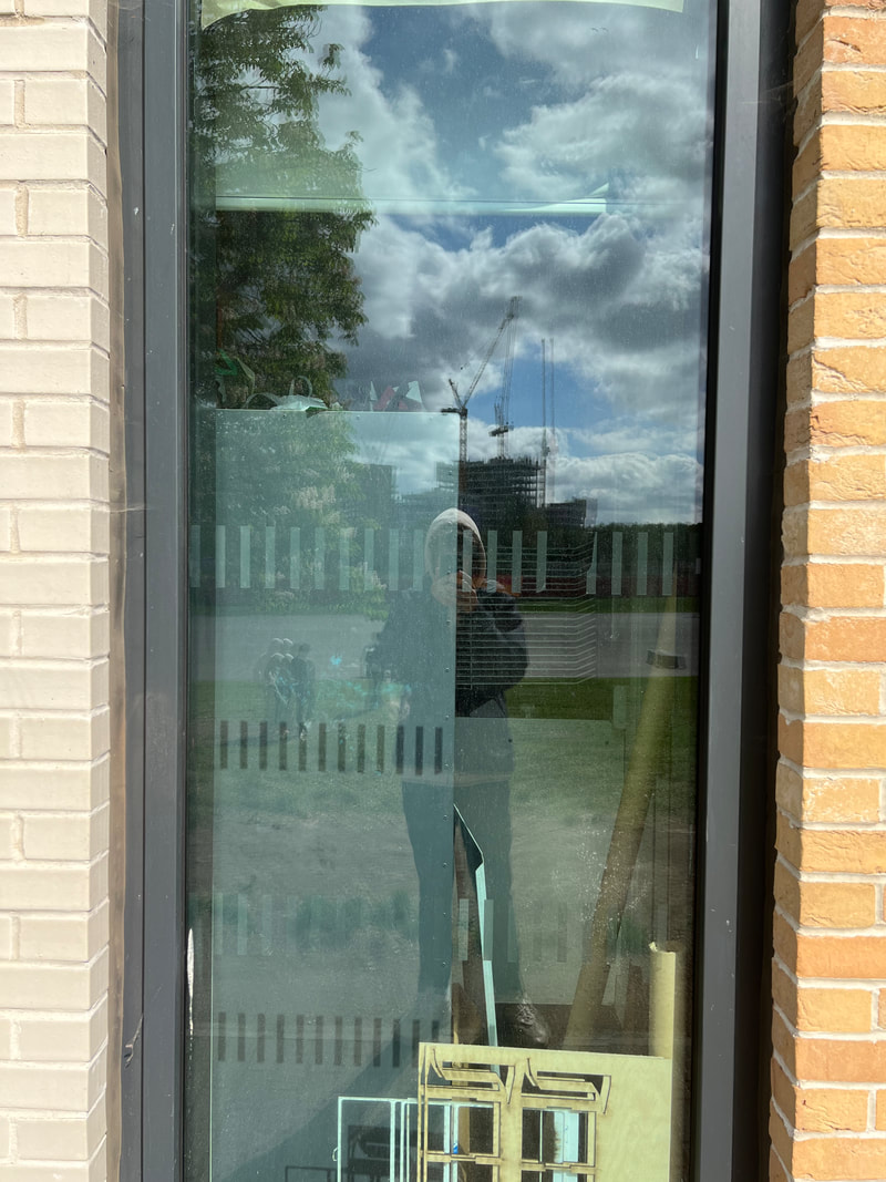
Today we were tasked with an activity of taking 5 self portraits in 15 minutes based on techniques such as: reflection, obstruction, layers, rule of thirds and symmetry. This activity was very quick which left not a lot of space for experimentation and trying different angles and techniques; which caused images like the bottom right one where there isn't a lot of techniques used and the image is just a plain image. In my opinion, my most successful image is the first one as i am utilising reflection and obstruction as well as the image having an element of mystery and a deeper meaning with the sign saying "help".


These two images are very similar as the right one is a photographic recreation of the painting made in 1657-1659 by Johannes Vermeer orchestrated by photographer Tom Hunter. Vermeer was fixated on using light in his artwork; whether it be the reflecting or bouncing of light off of objects in the image or the direction and where the light is coming from. For example, in this image the light source is coming from the left, through the window and is bouncing off the womans head, the apples in the fruit bowl and the window seal; Tom has mirrored this by using the babies head and the same woman figure as the subject for light to bounce off of. Although there are many similarities there also many differences. These include the obvious difference of a shift in time as the recreation is more modern and relatable to recent everyday life. Furthermore, The colour difference is relatively obvious as the recreation is a bit colder and darker with the light not hitting the background wall and illuminating it whereas in the original painting the light is bouncing off of the wall and lighting it up, it is also a warmer scene.

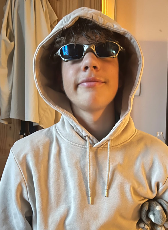
For this homework I had to recreate a childhood photo and I think I didn't do the worst although I could do better. This image was quite difficult to recreate as obviously i am a lot bigger now as i was ten years ago so I don't have the same jacket, toy or sunglasses; although I do have the same house although I take up a lot more of the frame making it harder to identify in the background. If I had more time I would think more about my positioning and the way my head is tilted in the first image as I have not conveyed that in the second image. Furthermore, I would change my appearance by straightening my hair as it is now curly and adding a warmer filter to improve how simular the two look.
Tyler Mitchell
Tyler has recently opened a new gallery called 'Chrysalis' where he is showcasing his images that display a Utopian vision of Black beauty, desire, and belonging. The images allude to the contemporary landscape while reflecting on the history of photographic images of black people. These images are composed with the similarity of encompassing nature and having a youthful subject relaxing or lying down in the foreground. Furthermore, the work also focuses on the subjects landscapes they live in whilst incorporating visual signifiers of spirituality, transformation and aspiration. Tyler also uses elements such as water, land and sky in natural and artificial forms as symbols of possibility and the again incorporating nature and the world we live and breathe in.

|
In this image I really like the composition with the balloons centred with the refection of the string leading down into the lower section of the image almost splitting the frame. The choice of using the lake as a mirror is really fascinating as questions pop into your head like: Why has he chosen something like a lake rather than just a mirror or a window to reflect off of? or why has he chosen to be that deep in the water where only his head is visible? The image therefore provokes questioning and has a sense of mystery. The colourful balloons also juxtapose the sort of duller natural colours in the background of grey clouds, muddy water and dark green trees. Moreover, I am also intrigued with the choice of the subject closing his eyes tight shut rather than having them open, this could have been done to create a sense of dreaminess which leaves us wondering if the scene we are seeing is real or in someones head when they are dreaming?
|


The first 4 images are a response to The Tyler Mitchell gallery that we went to see and are inspired by his style of abstraction and unique poses and compositions. I found this task particularly difficult as we was in the Green Park in the middle of London where there were a lot of people sat around and I am just sat upside down on a bench or doing a handstand in the middle of it all.
Next time I will possible take into consideration the camera angle and the FOV of the image because in my images they are just at waist height and at random angles; I could also incorporate the rule of thirds to add complexity and improve the overall result. The rest are some random images I composed throughout the trip and scenes when I saw an artistic opportunity. My favourite image that I took is the bottom left image where the man is in the centre of a lot of colours where the walls around him are littered with photo frames. When I was looking through the gallery I saw this align perfectly and felt like I had to take a snapshot of the moment. Overall, I really enjoyed the day although I much prefered the photographers gallery to the Tyler Mitchell gallery because it had a lot more content as well as more variety of genres and artists and different photographic techniques showcased in images. On top of that, the photographing throughout London was also fun as we were told to stick to a theme and to take pictures of that theme only; I picked a theme of blue although didn't really stick to it and just photographed whatever caught my eye and looked interesting E.G the fountain the floor numbers and the portraiture.
Next time I will possible take into consideration the camera angle and the FOV of the image because in my images they are just at waist height and at random angles; I could also incorporate the rule of thirds to add complexity and improve the overall result. The rest are some random images I composed throughout the trip and scenes when I saw an artistic opportunity. My favourite image that I took is the bottom left image where the man is in the centre of a lot of colours where the walls around him are littered with photo frames. When I was looking through the gallery I saw this align perfectly and felt like I had to take a snapshot of the moment. Overall, I really enjoyed the day although I much prefered the photographers gallery to the Tyler Mitchell gallery because it had a lot more content as well as more variety of genres and artists and different photographic techniques showcased in images. On top of that, the photographing throughout London was also fun as we were told to stick to a theme and to take pictures of that theme only; I picked a theme of blue although didn't really stick to it and just photographed whatever caught my eye and looked interesting E.G the fountain the floor numbers and the portraiture.
Chris Killip


These images are inspired by Chris Killip's monochromatic and black and white compositions. These images were very fluid and easy to do as we were just photographing each other going around the concourse and field. I really enjoyed working with a plain black and white setting as you don't have to worry about things like contrasting colours or some lighting as it is lost whilst using the filter. Using long exposure on the camera doesn't match his images very well although, I thought it matched quite well and is what he could improve on in his future compositions: playing with the exposure. The likeness to his work is very interesting and proves I met the point of the task very well; My favourite piece of work is definitely the lower angle from underneath the link with the shadows of the people from above working very well with the black and white filter as the silhouettes and outlines really pop up agains tyhe texture of the floor acting like a mesh between the two.
Viviane Sassen

|
Viviane Sassen is a Dutch photographer that lives in Amsterdam; she is 50 years old and focuses on body abstraction and geometric shapes. She is also known for collaborating with big brands such as Louis Vuitton, Adidas, Paul Smith, Acne studios and the designer Stella Mcartney. As possibly guessed because all these brands are linked to fashion and clothing she also takes a lot of her compositions as an advert/promotion for her clients brand. The image seen to the left is a Louis Vuitton photoshoot which depicts a boy in a baby blue suit holding a branded backpack with doves flying out. I really like this image as the suit colour harmonises with the blue sky in the background and so does the bag colour with the colour of his skin. Furthermore, I really like the mystery and the ambiguity of the pose the boy is supporting and the choices made by the orchestrater. Even further still, the choice of the photographer to include the snow white doves coming out of the backpack is intriguing yet puzzling as they don't seem to have any correlation to the product he is wearing or the scenery that surrounds him; although this all compiles into why I like this image so much. Sassen was studying fashion design at Utrecht school of the arts and later photographer after she realised that they are linked and go hand-in-hand with each other. Below are more examples of Vivianes colourful work:
|


I found this photographer quite tricky to recreate and take inspiration from because her work is very colourful and oversaturated; her images are very random yet interesting due to the backgrounds and props used in the images. As colour is a massive motif extensively used in Sassen's work it was quite hard to find varying bright colours all in one place at one time. I struggled with creativity a bit with this task because it was quite tricky to match the props she was using such as doves and paint to cover my hand and in school these are not at my disposal to use. To improve these pieces I would focus less on the background and experiment with a plain monochrome back ground and a vibrant and colourful subject. To make these pictures really pop I would also turn up the saturation to accentuate the vivid colours and brighten up the images.
Viviane Maier

|
Viviane Maier was born in Brooklyn New York in 1926 where she spent the majority of her life where she was thought to have lived as a Nanny for 40 years, until after her death a chest in her room was discovered which contained a collection of over 150,000 photos accumulated secretly over the years. These images had main themes such as reflection, candid and self portraiture. I really like Viviane Maiers work especially considering she was completely self taught to keep up this facade of being a strict Nanny.
|
Interestingly, this fascination of using reflections was not the then considered to be 'right' way to photograph things as photos were seen as simple subject in the center portraiture and nothing else. Viviane Maier challenged this and was very experimental which contributed to her fame after her passing.
The image above is one of my favourites of her work because of the many layers it has and the ambiguity of the scene. Viviane captures depth very successfully in her images where she has many different objects that create levels in the image such as cars, herself, buildings, trees and people in windows. The use of candid photography was frowned upon in her time as it was seen as rude and strange to not ask someone if they can take an image of them; despite this barrier Viviane did it anyway and some of the results are astonishing as she is capturing the rawest and realest version of that person as they are not being told to pose or change how they are all the time.
The image above is one of my favourites of her work because of the many layers it has and the ambiguity of the scene. Viviane captures depth very successfully in her images where she has many different objects that create levels in the image such as cars, herself, buildings, trees and people in windows. The use of candid photography was frowned upon in her time as it was seen as rude and strange to not ask someone if they can take an image of them; despite this barrier Viviane did it anyway and some of the results are astonishing as she is capturing the rawest and realest version of that person as they are not being told to pose or change how they are all the time.
My attempt


|
For this task we had to try and recreate the work of Viviane Maier and capture the way she used black and white and reflections in her photography. Whilst attempting to create my response we had a thick fog and it really helped set the mood and create a completely different school that I am used to every day; the fog makes an eerie atmosphere which is boosted with the older monochrome style. I really enjoyed using reflections as in all of my images my face is obstructed and distorted. My favourite image out of these is the one to the left because of the immense amount of layers within it. Moreover, on the ceiling inside there are leading lines which direct the viewers eyes towards the subject in the centre as well as light coming from the back of the building which fabricates a sense of emptiness and space within me in the image: which
|
PortURE RECREATIONtrait

We are going to recreate this famous portrait considering framing and lighting using studio lights. The key light to his right is at a diagonal angle and slightly elevated which will be simple to recreate using the studio lighting. Although, the composition may be difficult as none of our hair is the same as the man in the image and the hand positioning is difficult to recreate because if you don’t have them in the same place as they are in the painting the shadow on the subjects face will be different. Furthermore, the insane look on the mans face will probably prove difficult to recreate as none of us are actually insane and aren’t as good as acting either.

In evaluation, the final image is good and I think we captured the aspects that the painting has well and I think that the positioning and overall composition is accurate to the reference. My eyes act as centre points that follow you from within the frame and my arms are leading lines drawing the viewers eyes towards my head in the middle of the frame. Working in the studio was fun but in my style of photography I enjoy having a detailed or interesting background to make the eyes wander but with a plain black background there isn't much to interpret; so I probably wouldn't use the studio again. Although having said that, having full control of the lighting's colour, brightness and direction is very helpful as a pose to having to work with what is given. To improve for next time, I need to change my left hand placement and put it closer to my face where I am almost lifting up my fringe like the man in the original image is. It was also hard not to smile as it was in front of the whole class and a lot of people were looking so I have a tiny smirk in this image which i would improve on next time as well.


Campbell Addy


Campbell Addy is a photographer from South London. He likes to focus on underrepresented faces and the beauty and intricacy of visibility. He is one of the most in-demand fashion photographers in the industry working with designer brands and fashion companies. He has also photographed many famous faces such as Kendall Jenner, Tyler the Creator and FKA Twigs. When he was younger he was inspired by Nick Knights work and considered photography as a career. His work has been featured in established British Vogue, I-D, Wall street journal, Time and The rolling Stone magazine to name a few. He also focuses on Queer and black minorities in most of his work as he has experienced discrimination in the past. Observations on his work:
- All of his work incorporates people of a certain minority who are usually under-represented
- Addy mainly uses the most common type of portraiture where there is one person in the center of the frame.
- I love the vibrant colours that he uses throughout his work that really make them pop and stand out. Such as crimson, baby blue and mustard yellow.
- The interesting facial expressions and poses that the subjects possess intrigues me and makes me want to know more about the image and the photographers choice of composition.
- Addys models usually wear abstract and sometimes flamboyant costumes and outfits in his portraiture.
- Even though he usually uses very vibrant and saturated colours he also experiments with some black and white images which are just as awe inspiring as he proves that he doesnt needs colour to orchestrate a good image.
- Furthermore, he sometimes adds a sense of mystery and ambiguity through face covering and masks.
- Another notable feature that i have noticed in his work is that he likes to encorporate flora and nature into his compositions which further extends his ideology of the beauty of intricacy.
- There is also an overwhelming sense of love and acceptance throughout all his images where he shows these bold and confident queer and under-represented people and then makes them very much shown throughout whether that is through the publishings of his book or the magazines he is featured in.
- Lastly he usually makes his subject stare straight down the camera lense which creates a sense of dominant eye where it follows you wherever you are which adds a layer of creepiness and scariness.


Nico Froelich


|
|
- Another common theme i have noticed in Nico's images is that most of his work is taken at 'The Golden Hour' or at dusk; this further shows his use of shadows, leading lines, silhouettes and outlines.
- The immense amount of space sometimes used in his photos highlights the subject and creates a wider picture with wider interpretations.
- The words i would use to describe his work are; nostalgic, warm, uncanny, eerie and intruiging.
- I can tell that he used a camera to take all of his images because of the high quality and resolution of the pictures. Although with his camera i would like him to experiment with different shutter speeds to amplify that eerie look and add mystery.
Manipulating and editing images

|
To make this piece I printed out the same image three more times but every time changed the colour settings on the printer to give me an alternative variant of the original image. I then cut out part of those images to stick on the original image; this made the image seem still aligned and one but some of it had a different colour or filter to it. Next, I cut up some sticky transparent vinyl and stuck it on bits of the image to again keep the image the same but just change the colour of some of it. I don't like this piece because of the randomness and unpredictability of it because an eye or a star just don't relate to the image and are irrelevant. Next time I would think about what I am doing more and keep the alterations to being related to the original image as well as not taking it over the top and over editing it like I did with this one. Although, I do like the images below where I used photoshop to alter the images in three different ways:
|
colour, texture and alignment. The first one I used the cyanotype filter to achieve that blue effect on the image. The next one I used the edit and then transform window and then went into the liquify tool were I smudged my face to make it look like it is melting. Finally, on the last one I cut out my eyes and replaced them with the original unaltered image.


Rankin Destroy project.


|
The Rankin Destroy project was a way to address his criticisms and to respond to his critics; he destroyed his images and then sold them for high prices. The profits of the sales of the art works benefit a music charity for young people. Rankin destroyed his artwork to create a unique and abstract effect. The images arent my favourite and i dont really like them because i dont see many photographic techniques being used and they are quite basic. Although I really like the one to the left because it has more of a sense of how to compose an image and the manipulation of it is very interesting and makes the image look intruiging and eye-catching. If i were to compose images as a response to these ones i would add in more variables into the image in the first place such as more people or shooting at a different angle to create movement and fluidity in the images.
|
Layers and cutting


|
I started with this image intending to alter and distort it by cutting it up and using layers. The software I will be using is Photoshop.
|
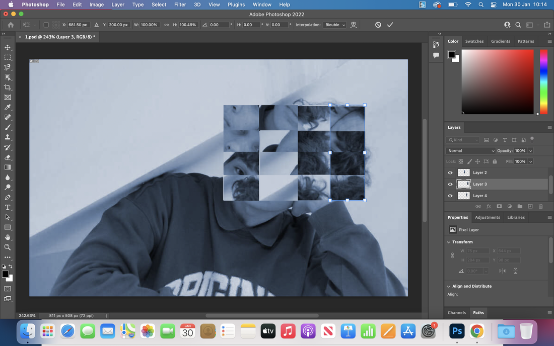
1.First step, use the rectangular marquee tool to cut out the different shapes that you want-here i chose 4 rectangles. Every time you cut you need to make a new cut layer ,this will ensure that you can move each shape individually.
|
2.The Second step is to use the move tool and re-arrange the shapes in a different order. Once re-arranged, make sure to save as not to loose any progress.
|
|
3. If you repeat all of the first two steps vertically you create a cubic mesh look where your image is completely muddled up and almost puzzle like. To help make the shapes fit perfectly you can also go into the 'edit' window and scroll down to transform and then click scale to create the perfect fit and ensure that all of the shapes fit together perfectly and are neat. Lastly, I adjusted the colours and filters on the whole image to what I think looks best.
|
|
Final result


These two images were my final result (I couldn’t t pick what one i liked more although the one on the right looks neater and a bit more professional). They were very annoying and tedious to create as the layers were very fiddly and irritating as there was so many of them and they were all muddled up as well. Next time I would look closer on the fine details and be more careful when making cuts because in some of them i got unwanted bits of image included which just creates loads of tiny black and white lines on the edges of the shapes. I would also possibly distort it more by including texture filters and giving the image an older or more rustic vibe.
Liquify experiment

|
Using photoshop isn't my favourite as it has a lot of buttons and menus to navigate but this task was quite simple. All I had to do was select the edit menu at the top of the page and scroll down to transform from then I click liquify and swirl with my mouse on the screen to create this look. If I were to do this again, I would add more layers for more complexity and also cut out some bits and rearrange them. Furthermore, I could experiment with changing colours and adapting the mood of the image; a monochrome image radiates a sad or melancholy mood whereas say bright colours give off a much happier and joyous mood.
When physically editing in real life with cut outs and sticking bits and pieces together I will consider mixing and matching the cut outs with different colours of the same sections creating repeated patterns with diversity and variety included. |
Photograms


|
This is the enlarger that shines light on the special light reactive paper and exposes it to create an outline of the templates put on top of it. It has a safety filter which helps show the size of the area being exposed to the light to make sure all of the light sensitive paper will be reacted and not have completely black and over exposed edges. The main lights in the room can be off, red and normal with red being used the most as you can safely handle the light reactive paper without ruining it in this light. The timer on the left of the enlarger times the light exposure to ensure the image is properly exposed and not too over exposed which would make the image very dark or not under exposed where the image would turn out very pale, faint and white.My photogram was exposed to the light for approximately 10 seconds which was perfect for it because the image is quiet a dark image so a longer exposure time would make the outlines pop and to have the perfect amount of contrast to easily distinguish shapes.
This image is of the developing line where the chemicals develop and maintain the exposure before being in contact with more outside light. From left to right, it goes a minute or so in the developing chemical, then 30 seconds in the stop chemical to stop it developing too much and ruining the image and then a minute or so in the fix so it cannot be changed or altered by more light and to maintain it. Lastly, it is left in running water and all the stinky and irritable chemicals are washed off so that the photogram doesn't go brown after a while and to then dry it off. |


Photo joiners
David Hockney


|
To create the David Hockney design firstly I created a blank canvas and then opened an image that I want as the base. Next using the marquee tool, you cut out the section of the image that you want and press command C to copy and then command V on the base layer to paste it. Once on the desired base image it can be moved using the move tool, arranged using the layer tab and then scrolling down to arrange as well as going into the edit tab and adjusting the size to align and fit in. I do not like the overall outcome of the image because it looks unprofessional and the bottom part of the face is way too big. Next time I will take way more images to match David Hockney's style and to create a clearer and more impressive finished piece. Personally, I prefer the physical editing with scissors paper and glue rather than using photoshop because it is easier, takes half the amount of time and I can create more images exactly how I want them. Out of the 3 physically edited images my favourite is probably the one of my dog because it aligns the best but it can still be seen that it is a compilation of different images.
|


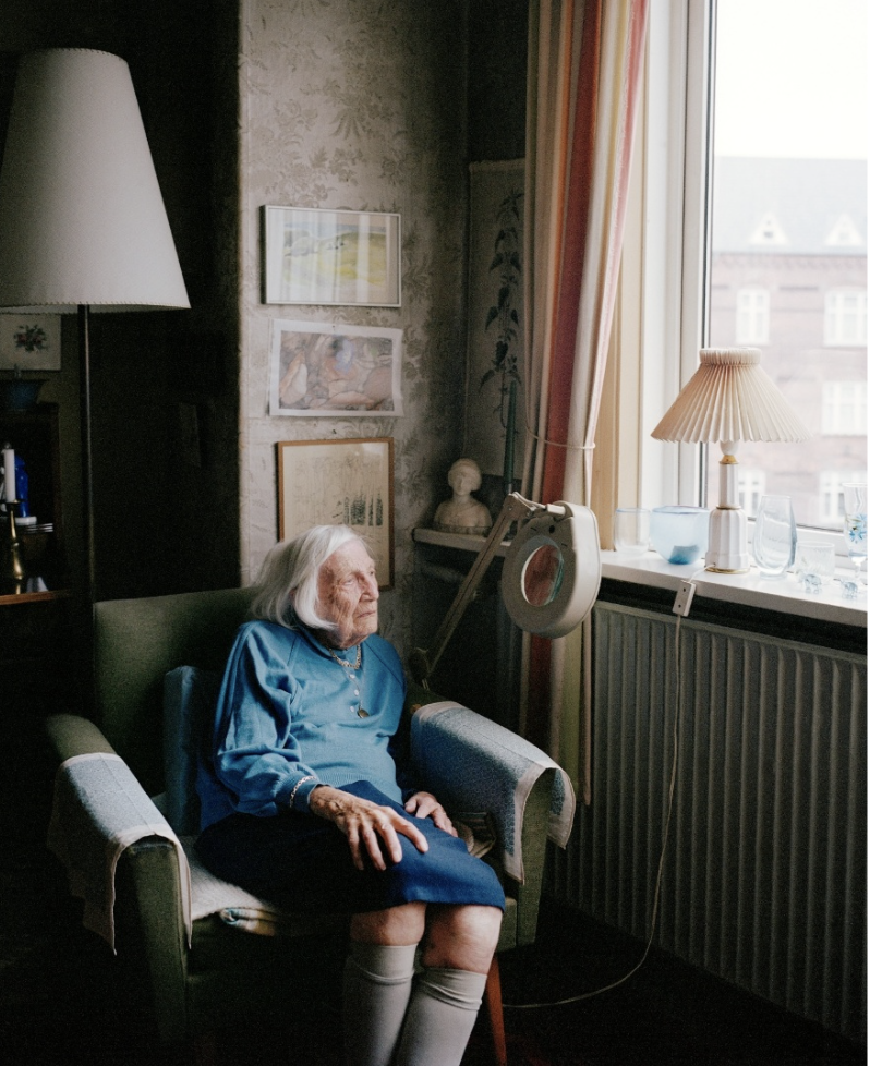
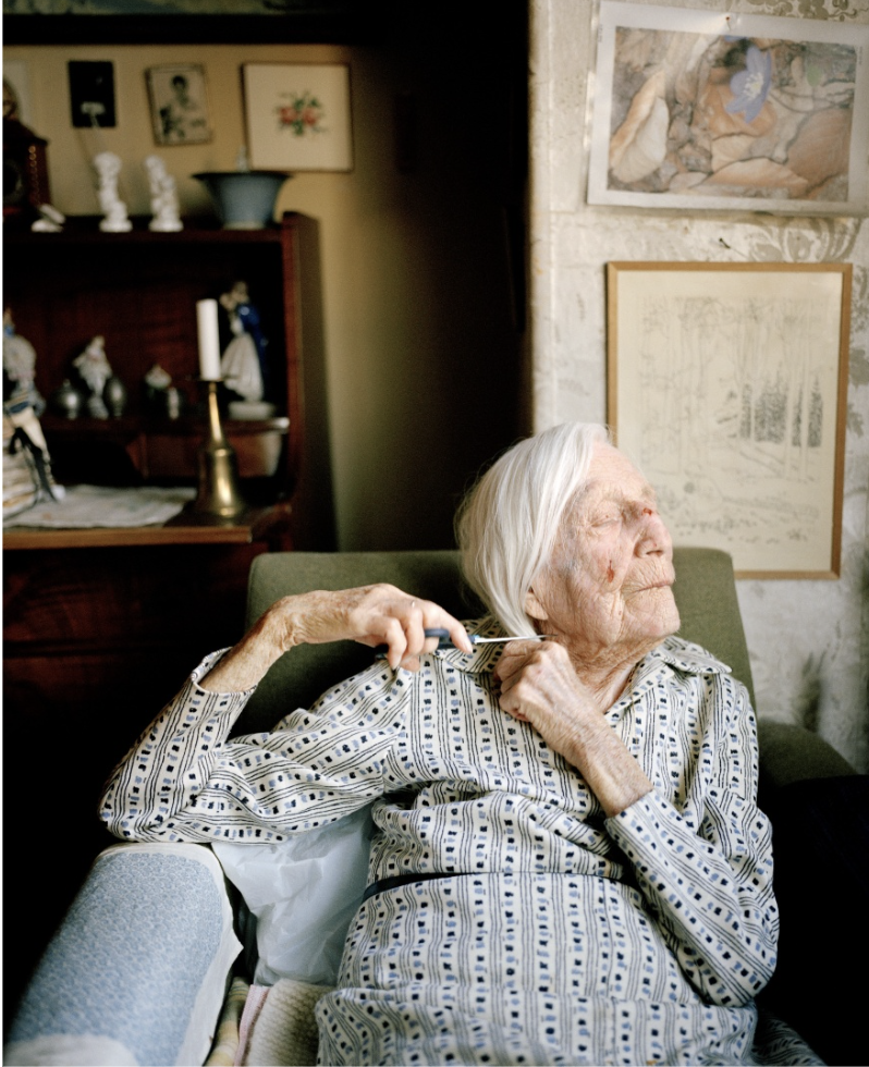
Hannah Lenz: Else


|
Analysis:
These images are very interesting because of the deeper meanings throughout all of them: everything within has a connection. These environmental portraits showcase who the subject person is and what they like and what sort of person they are. For example from the top middle image I can infer that she is very organised and likes to keep everything uniform from the tidy table top as well as being able to tell that she has a wide range of family members via the portraits on the walls and side tables. This contributes to why i like these images so much as I can tell so much about the person just by looking at a frozen still image. Moreover, I admire the framing and angles used throughout these images because they all display Else's surroundings rather than just a centred image of her which would be boring and single tone as it would be harder to determine these factors and inferences about her without showing her living space. Thinking about photographic techniques Hannah uses a lot of leading lines directing the viewers eyes to the subject as well as using a lot of repeating shapes and forms such as picture frames, lamps, plates, cups and more. If i was to orchestrate these pieces I would consider incorporating some more creative angles to make the images more unique and enticing. Although, overall I wouldn't change much in these images because i really like the deeper hidden memories and feelings linked to every object in the background and how i can infer and tell things about the subjects personality from them aswell. 
|
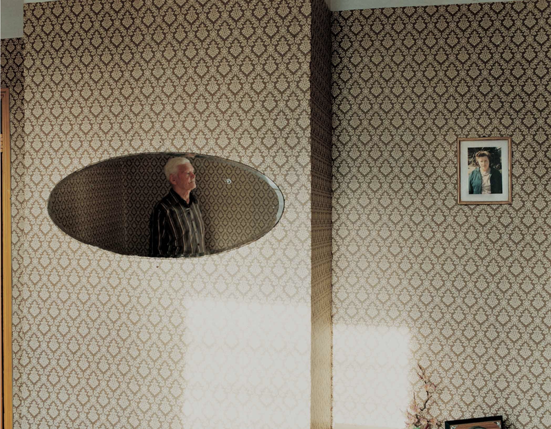
'For Every Minute You Are Angry You lose Sixty Seconds of Happiness 'by Julian Germain


|
Analysis:
The thing i love about Germain's images is that through all of them you can see a lot of emotion and feeling through the subjects face and gestures. The image to my left is my favourite because I love the pride in Charlies face as he is showing his work to the camera you can really tell that he loves colour and vibrance as his houses wallpaper matches these flowers giving off a nice complimentary colour palette. The techniques he uses also are intriguing from the use of matching colours, leading lines, patterns and different angles to centring and asymmetry. Much like Hannah's work the environmental portraiture gives us an insight into the life of Snelling and all of his memories commemorated through objects in his house. The lingering sadness inferred from these images is stomped out by the quote of Germain, "Charlie is alone but not lonely, he is surrounded by the things he loves, the photographs of his life with Betty, his colourfully decorated house and his small garden and greenhouse." This quote along with Julian's work showcases Charlie Snelling as if you are a close friend of his where you visit him on a daily basis as Julian described himself as doing. Photography is a way to document life, connections and relationships as well as personalities and memories of the past. Personally, I can't think of anything to change about his work as most of the boxes are ticked and the results are very interesting and make you want to see more and know more about the subjects life. |


Diptychs


The similarities that the diptychs have are the environment in the second image of the couple matches the aesthetic of the first: in the diptych created by Julian Germain, Charlie is proudly showing a camera to Germain, this matches the gesture carried out by Snelling's wife in the photo frame where she is displaying the flowers on the pot to the photographer. Also, the bright colours also match each others aesthetic creating a happy atmosphere in both. Whereas in the images of Else the colours match with a sky blue although one looks cosy and tidy whereas in my opinion the portrait of Else looks sad and cold. This might be to do with the warmer lighting in one and a cooler lighting in the other but they juxtapose each others atmospheres.
The differences with the diptychs is that one set shows a narrative of pure loneliness but the other shows one of loneliness comforted by memories and love. In the images produced by Germain, Charlie is very much happy but longing but Else in the images created by Hannah looks a bit lost and confused.
The differences with the diptychs is that one set shows a narrative of pure loneliness but the other shows one of loneliness comforted by memories and love. In the images produced by Germain, Charlie is very much happy but longing but Else in the images created by Hannah looks a bit lost and confused.


